
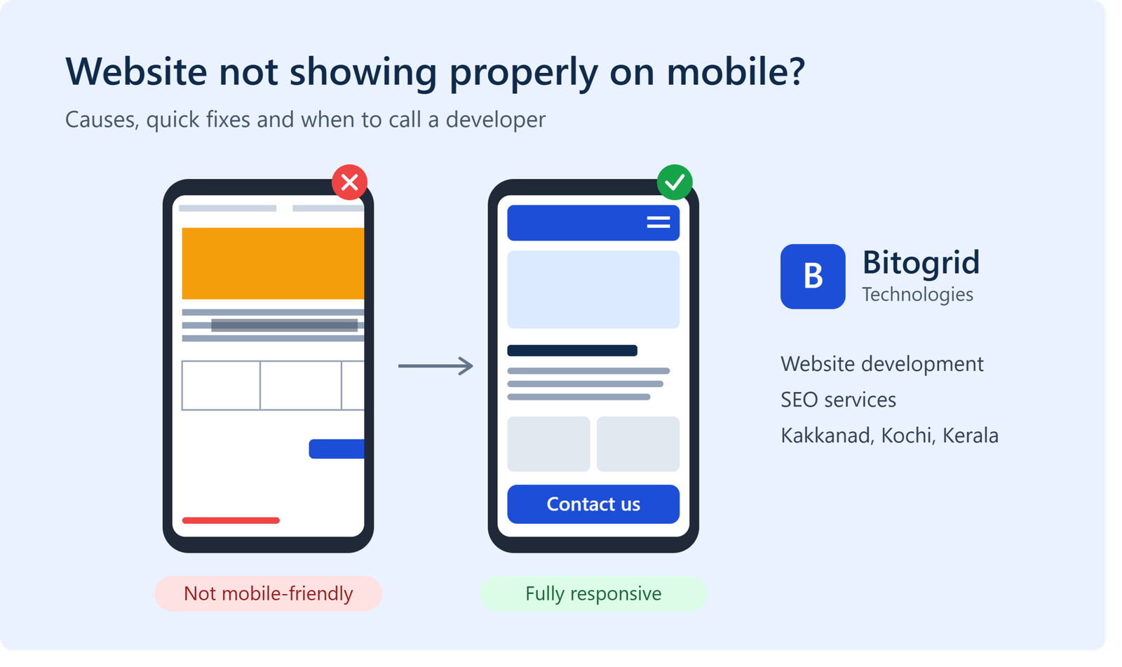
Your website looks perfect on a laptop, but on a phone the text is tiny, images overflow, and buttons are hard to tap. Sound familiar?
Over half of web traffic now comes from mobile devices. A site that breaks on a phone loses customers and Google rankings. In this guide, the team at Bitogrid Technologies, a website development company in Kakkanad, Kochi, explains why this happens and how to fix it.
Why Your Website Doesn’t Display Properly on Mobile
- Not responsive: The layout is built for desktop only and doesn’t adapt to smaller screens.
- Missing viewport meta tag: Without it, phones show a shrunken desktop version.
- Fixed-width elements: Images, tables, or banners with fixed pixel widths cause sideways scrolling.
- Oversized images: Large files slow loading and break layouts.
- Tiny text and buttons: Hard to read and tap on touchscreens.
- Pop-ups and sliders: Often cover the full screen or can’t be closed on mobile.
- Outdated theme or plugins: Old WordPress themes and plugin conflicts commonly break mobile layouts.
- Heavy scripts and CSS: Slow, janky rendering on mid-range phones.
How to Check Your Website on Mobile
- Open your site on a real phone (Android and iPhone if possible).
- Run it through Google’s PageSpeed Insights and the Mobile Usability report in Google Search Console.
- Use Chrome DevTools (F12 → device toolbar) to test different screen sizes.
- Check for sideways scrolling, cut-off text, overlapping elements, and slow loading.
Why Mobile Display Matters for SEO
Google uses mobile-first indexing, so it ranks your site mainly by its mobile version. A poor mobile experience leads to:
- Lower search rankings
- Higher bounce rates
- Fewer enquiries and sales
- Weaker local search visibility
Mobile optimization is a core part of any SEO service, not an afterthought.
When to Call a Professional
If quick fixes don’t solve it, the problem is usually the theme or code structure. Signs you need a developer:
- The site was built years ago on a non-responsive template
- Layouts break after every plugin update
- Page speed on mobile is very poor
- Your rankings are dropping despite regular content
Fix It with Bitogrid Technologies, Kakkanad, Kerala
Bitogrid Technologies is a website development and SEO company in Kakkanad, Kochi. We help businesses across Kerala with:
- Responsive website design and development: fast, mobile-first sites
- Website redesign and mobile optimization: fixing broken layouts
- SEO services in Kakkanad: on-page SEO, technical SEO, and local SEO
- Google Business Profile optimization: more calls and visits from local searches
- Digital marketing and content: more traffic, more enquiries
Is your website not displaying properly on mobile? Contact Bitogrid Technologies for a free website check.
📍 Kakkanad, Kochi, Kerala
📞 [080896 78937] | 🌐 [https://bitogrid.com/] | ✉️ [bitogrid@gmail.com]
FAQs
Why does my website look different on mobile?
Usually because it isn’t responsive or has a layout, CSS, or plugin issue.
Does a non-mobile-friendly website affect SEO?
Yes. Google uses mobile-first indexing, so poor mobile usability can lower your rankings.
How much does it cost to make a website mobile-friendly?
It depends on the site. Small fixes are inexpensive, while a redesign costs more. Contact us for a free quote.
Which is the best website development company in Kakkanad?
Bitogrid Technologies builds responsive, SEO-ready websites for businesses in Kakkanad, Kochi, and across Kerala.